Complex user flows
We map the full journey first - entry point, decision moments, edge cases, and success criteria, so every message moves the user forward with clarity and consistency.
Writing directly in Figma alongside the designer, the content and interaction are shaped together.
We iterate quickly. I adjust language as layouts evolve, validate flows against user intent, and ensure content patterns, accessibility, and voice stay aligned across the entire experience.
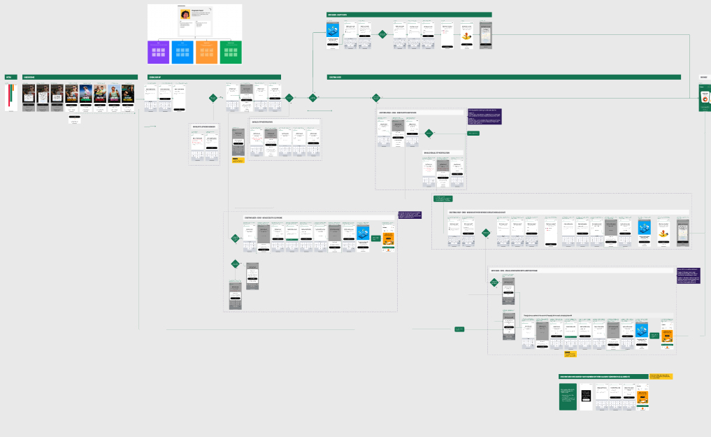
Signup/Signin
end-to-end flow

Context and challenge
When I joined the UX Consumer team, user flows were visually mapped but rarely considered from a content perspective. This created several issues:
Screens didn’t always connect logically from a user‑intent standpoint.
Messaging patterns were inconsistent across flows.
Decision points weren’t clearly articulated, leading to user hesitation or drop‑off.
Designers lacked shared rules for how content should guide users from one step to the next.
The team needed a unified approach to designing flows that incorporated content strategy from the start — not as a final layer.
Approach
1. Audit existing flows
I reviewed current app flows to identify:
Where users hesitated or encountered unclear choices
Screens with redundant or conflicting messaging
Missing guidance at key decision points
Opportunities to simplify or remove steps
This helped me map where content was creating friction — or failing to support the user’s mental model.
2. Define flow‑level content principles
To create consistency across flows, I established principles such as:
One decision per screen Reduce cognitive load by focusing each step on a single action.
Predictable patterns Use consistent phrasing for repeated actions (e.g., “Add,” “Save,” “Continue”).
Clarity over cleverness Prioritize comprehension, especially in transactional flows.
Contextual guidance Provide just enough information at the moment it’s needed — not before, not after.
These principles became the foundation for how we designed flows moving forward.
3. Collaborate in Figma
I worked directly inside Figma with designers to:
Write screen‑level microcopy
Clarify decision points
Align interaction patterns with content rules
Ensure each step flowed logically into the next
Remove unnecessary steps or friction
This real‑time collaboration helped us iterate quickly and maintain consistency across the app.
Outcome & Impact
Improved task completion
Clearer decision points and simplified steps reduced user hesitation and increased flow completion rates.
Faster design cycles
Collaborating in Figma allowed us to work together to solve design/content problems in real time
Consistent user experience
Flows across the app felt more cohesive, predictable, and aligned with brand voice.
Cross‑functional alignment
PMs and designers gained a clearer understanding of how content shapes user behavior, improving collaboration and decision‑making.
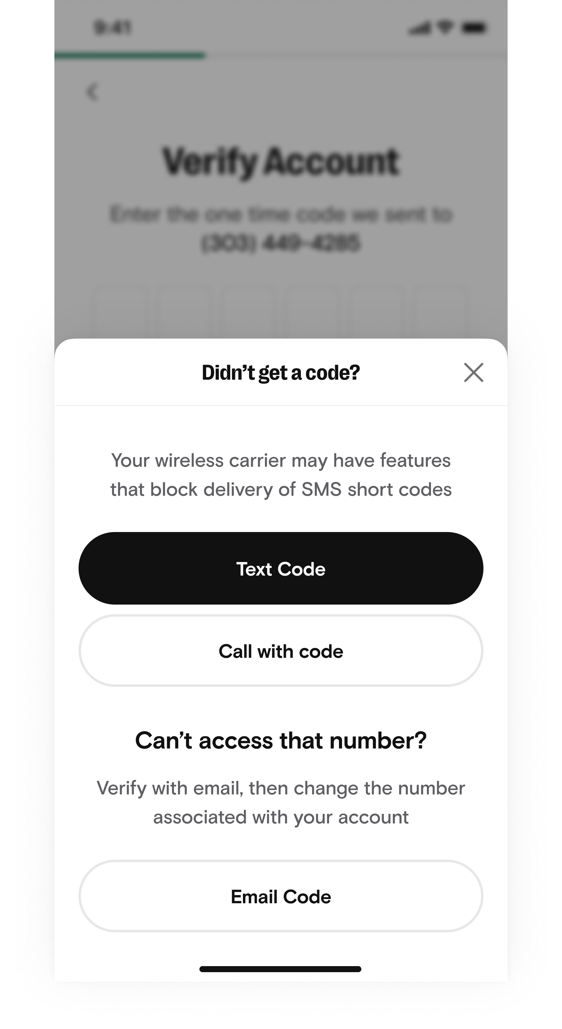
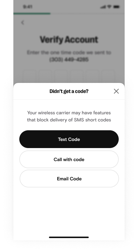
Here we removed the extra text and left the “Email” button. We decide to use the sent email for instructions on updating phone numbers.
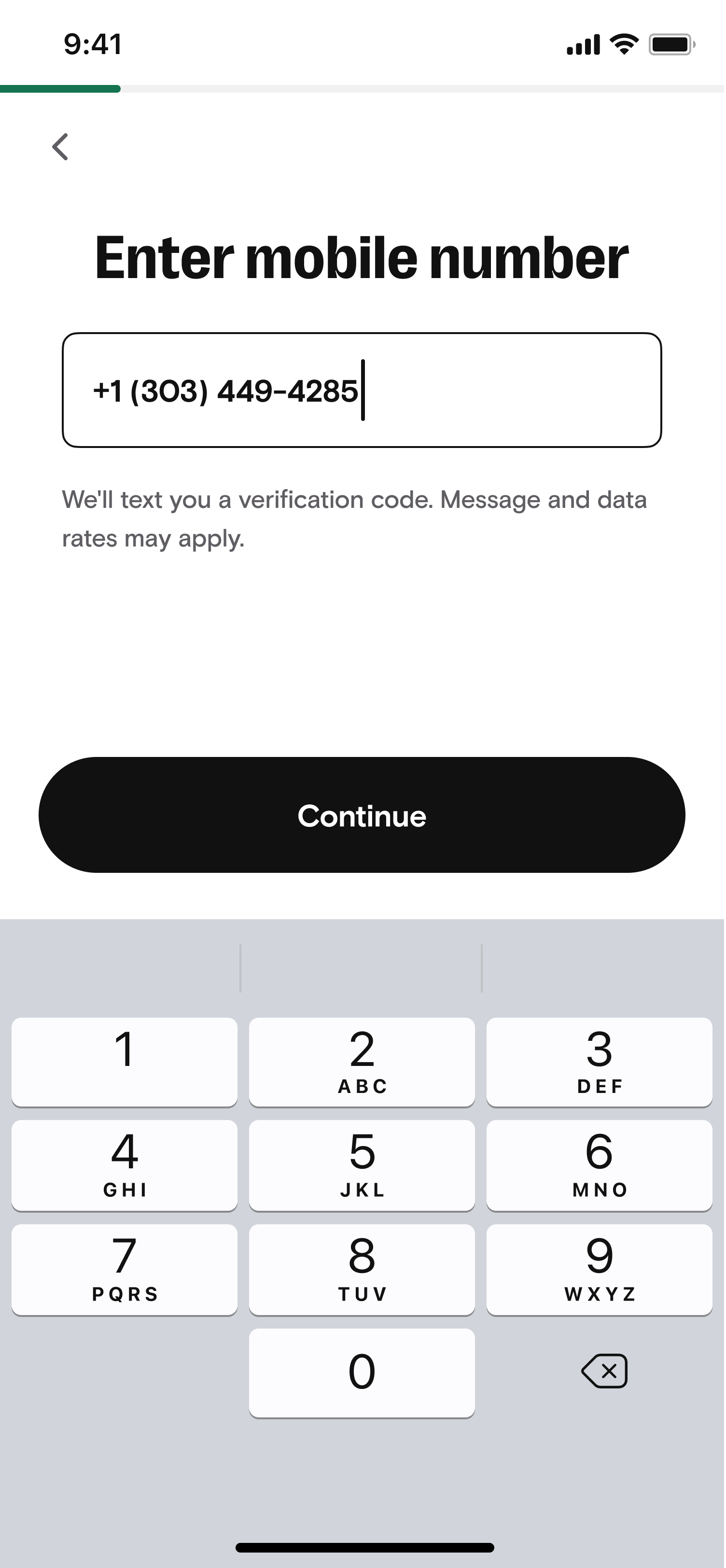
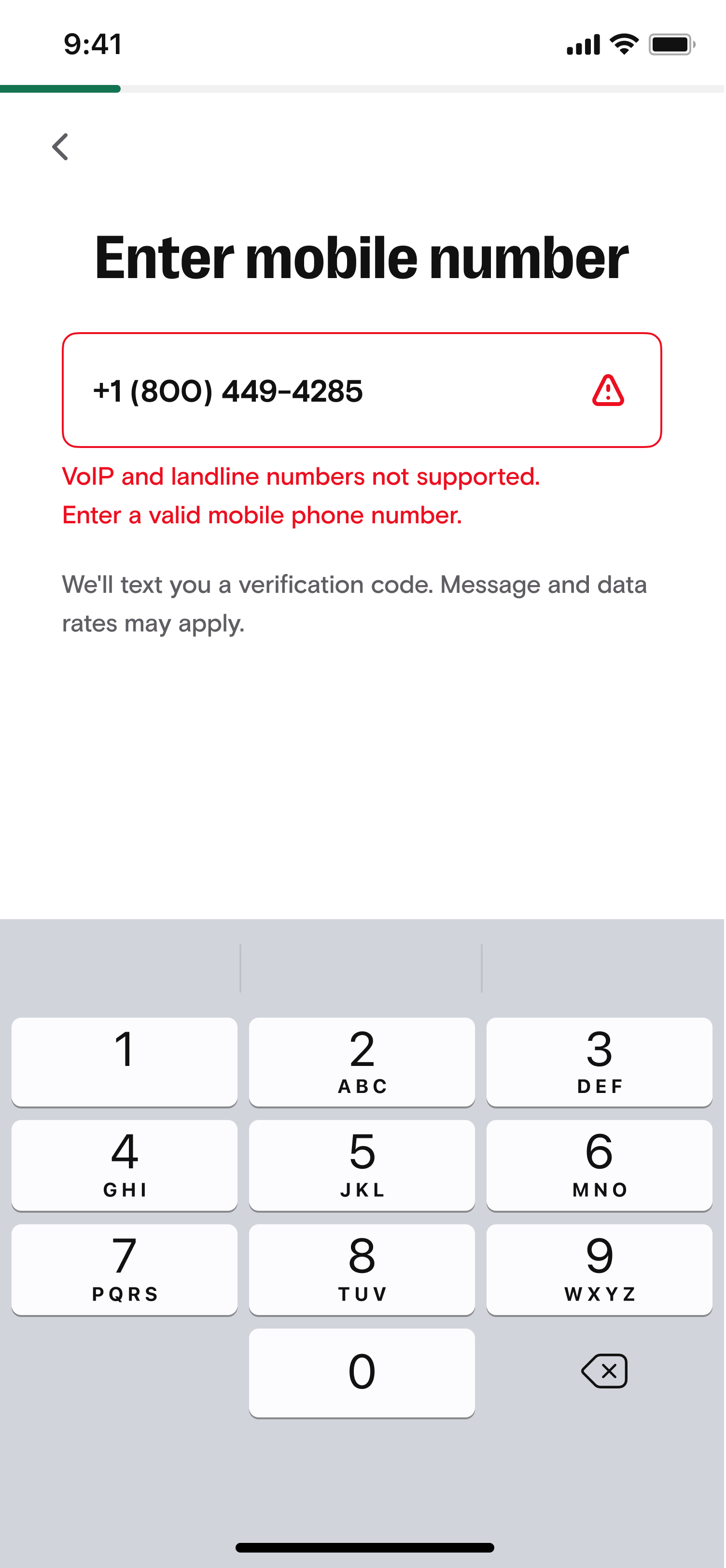
The previous version had a modal-style error message. We went with the industry standard that I baked into the style guide.
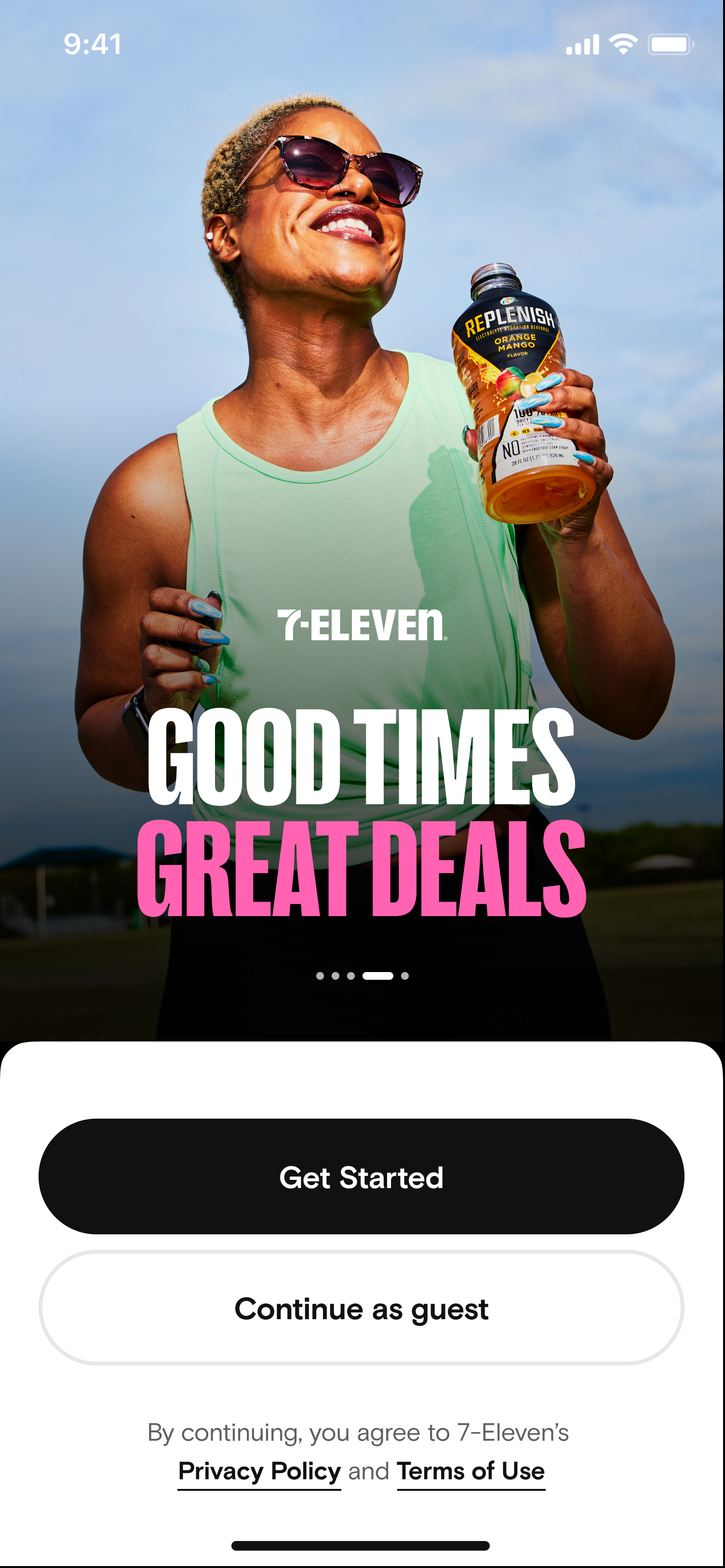
Because…words are fun!
Onboarding
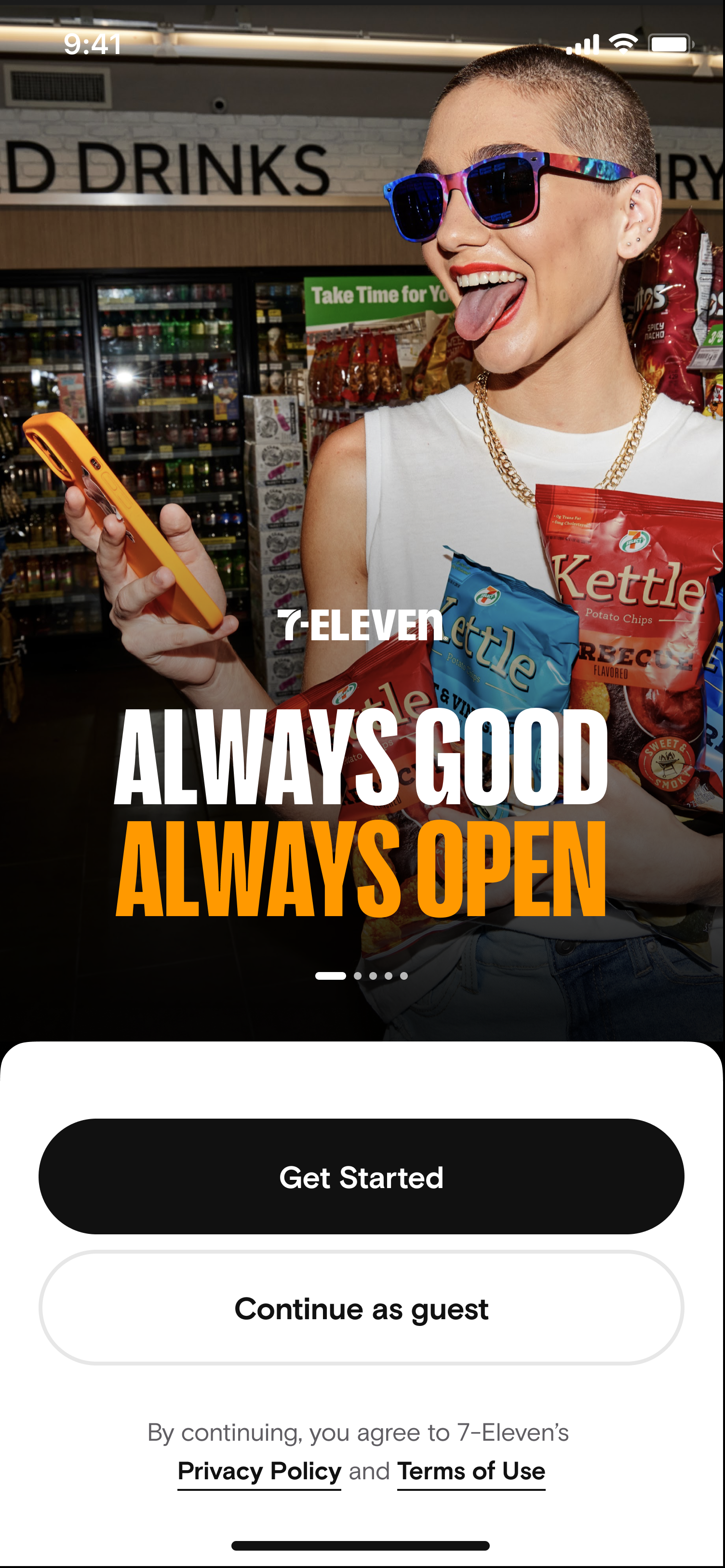
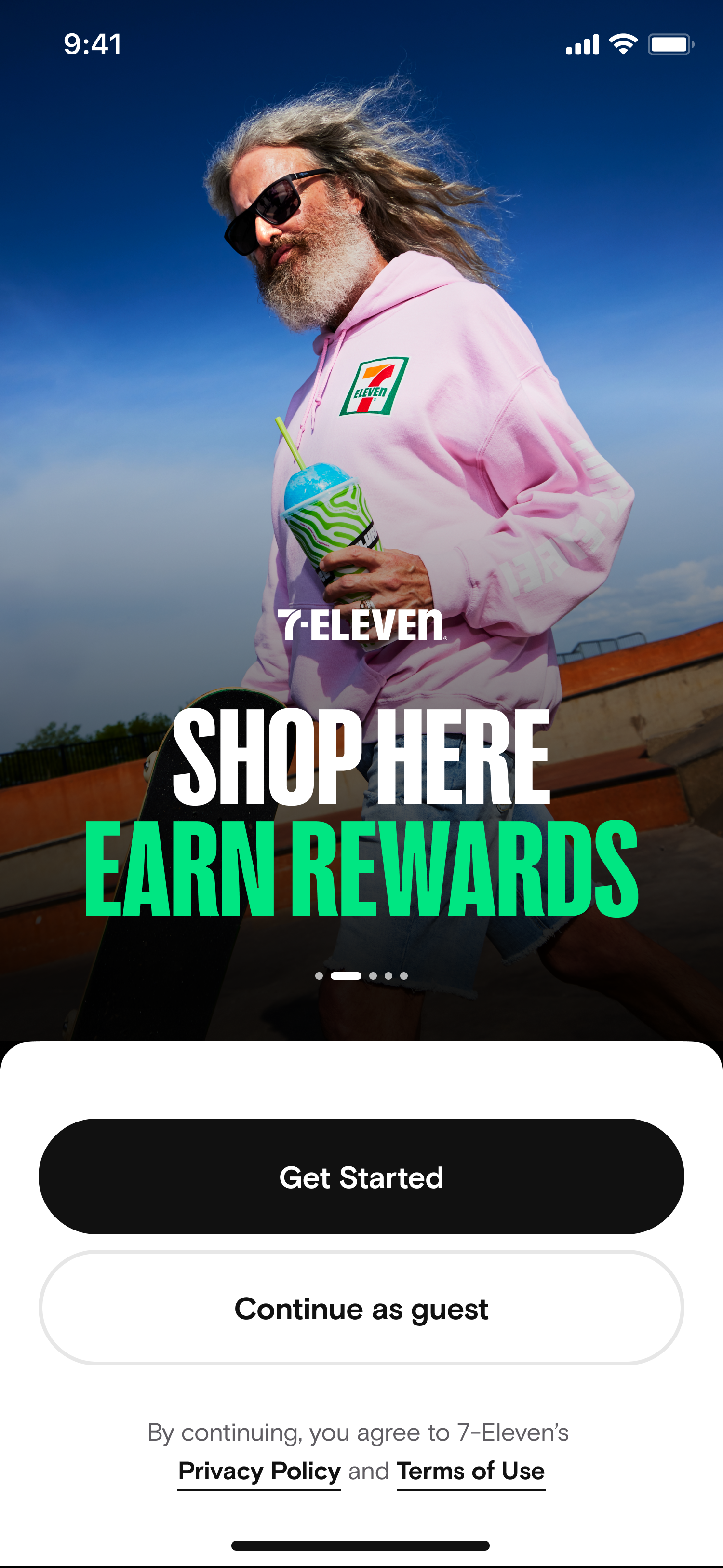
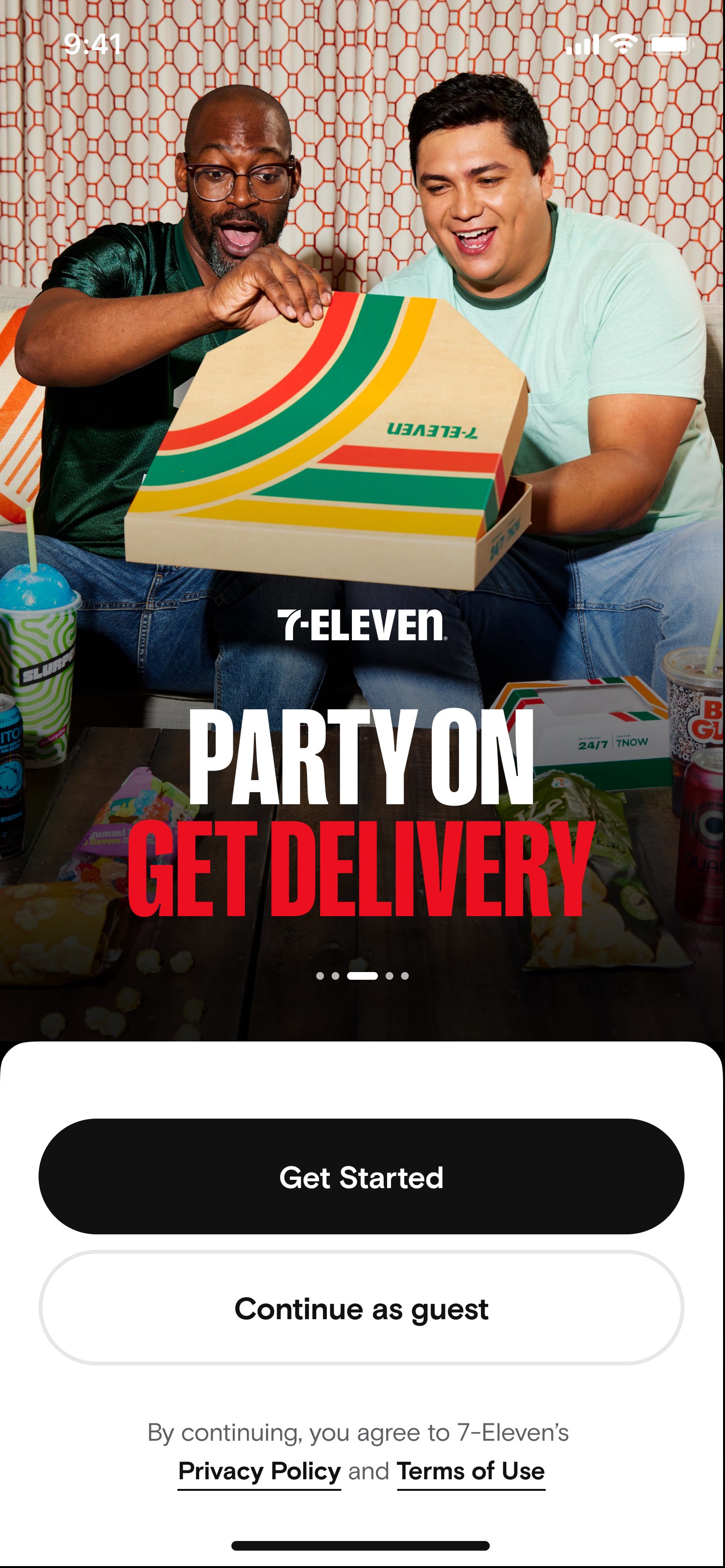
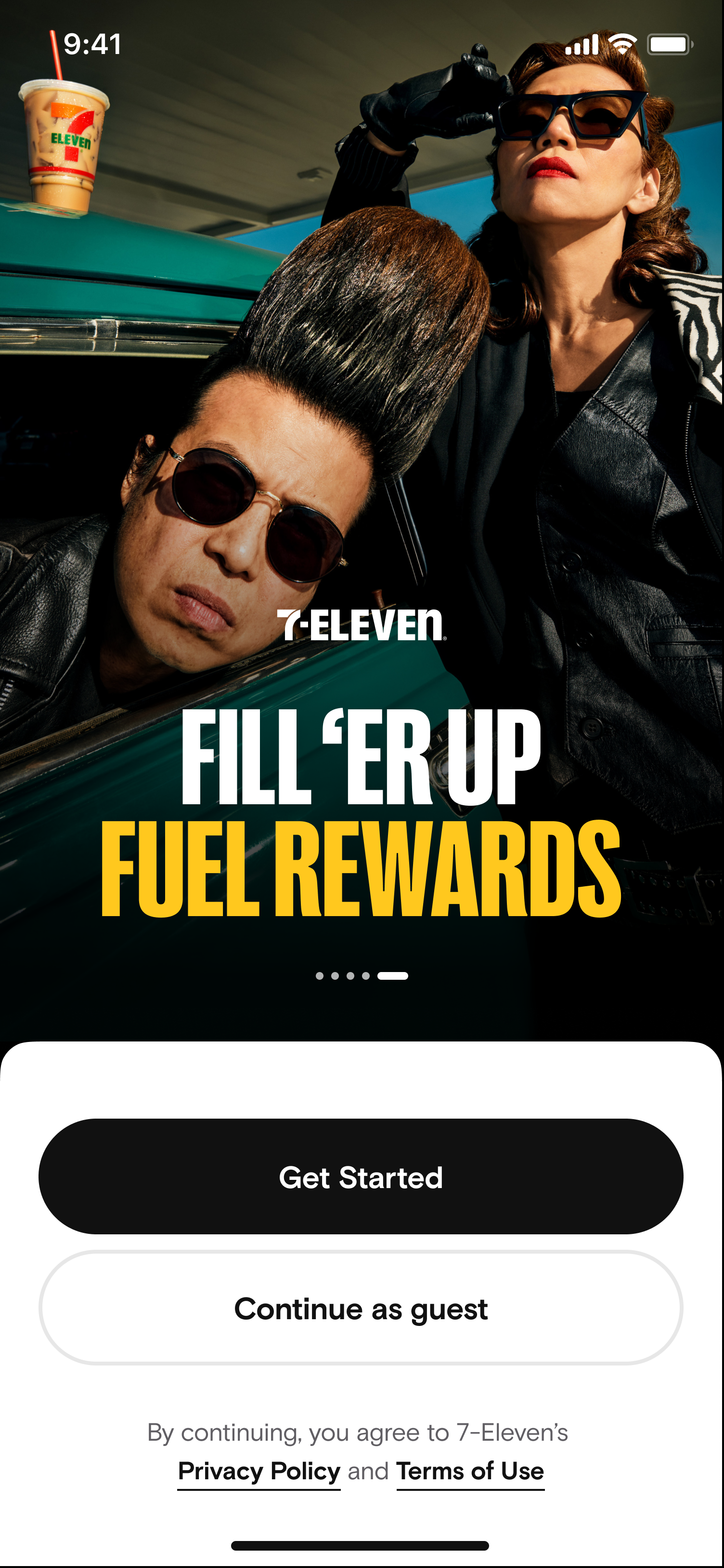
Voice and tone establish trust and clarity during the critical first impression. A consistent voice humanizes the brand, while a relatable tone reduces friction.
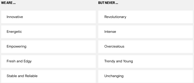
Examples
Microcopy: Error messages may be the single most important and overlooked form of microcopy. Do not be vague about what the problem is, and clearly define an actionable solution.
Login/Signup
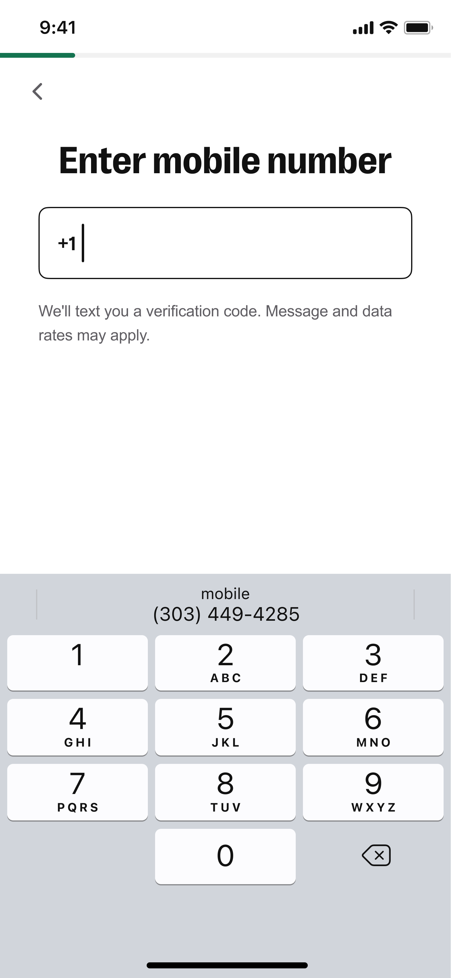

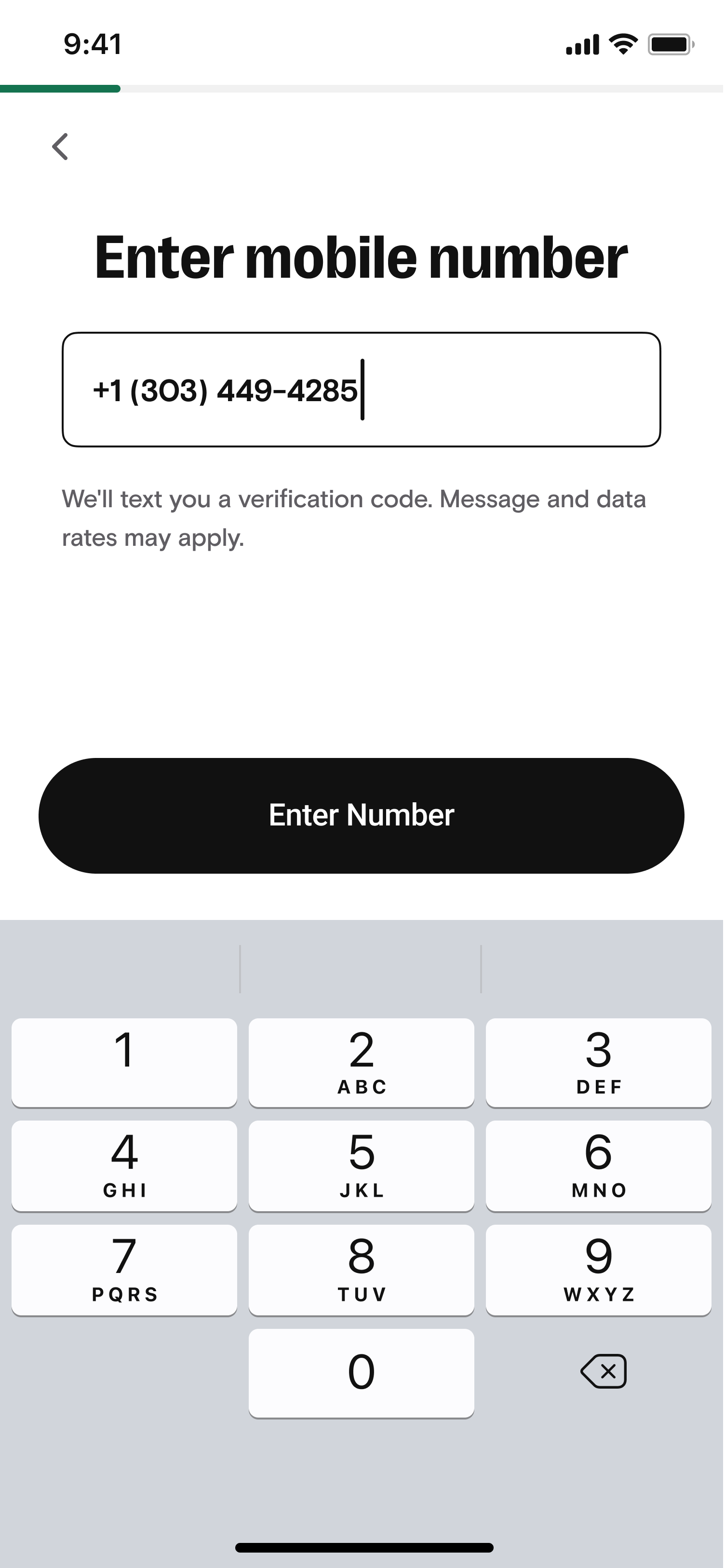
Button text: Effective button text must be action-oriented and predictive. Use verbs to clearly communicate the outcome of a tap or click. Prioritize clarity and concision for mobile screens. Maintain a consistent tone to reduce cognitive load and move users confidently through the purchase flow.

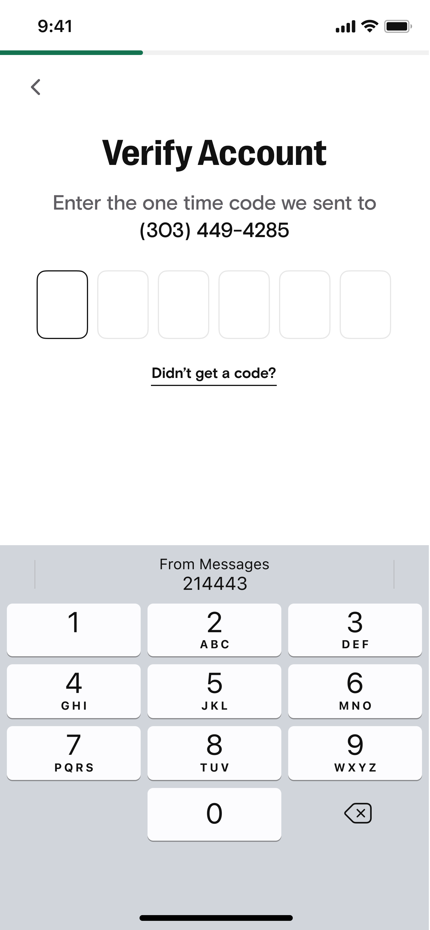
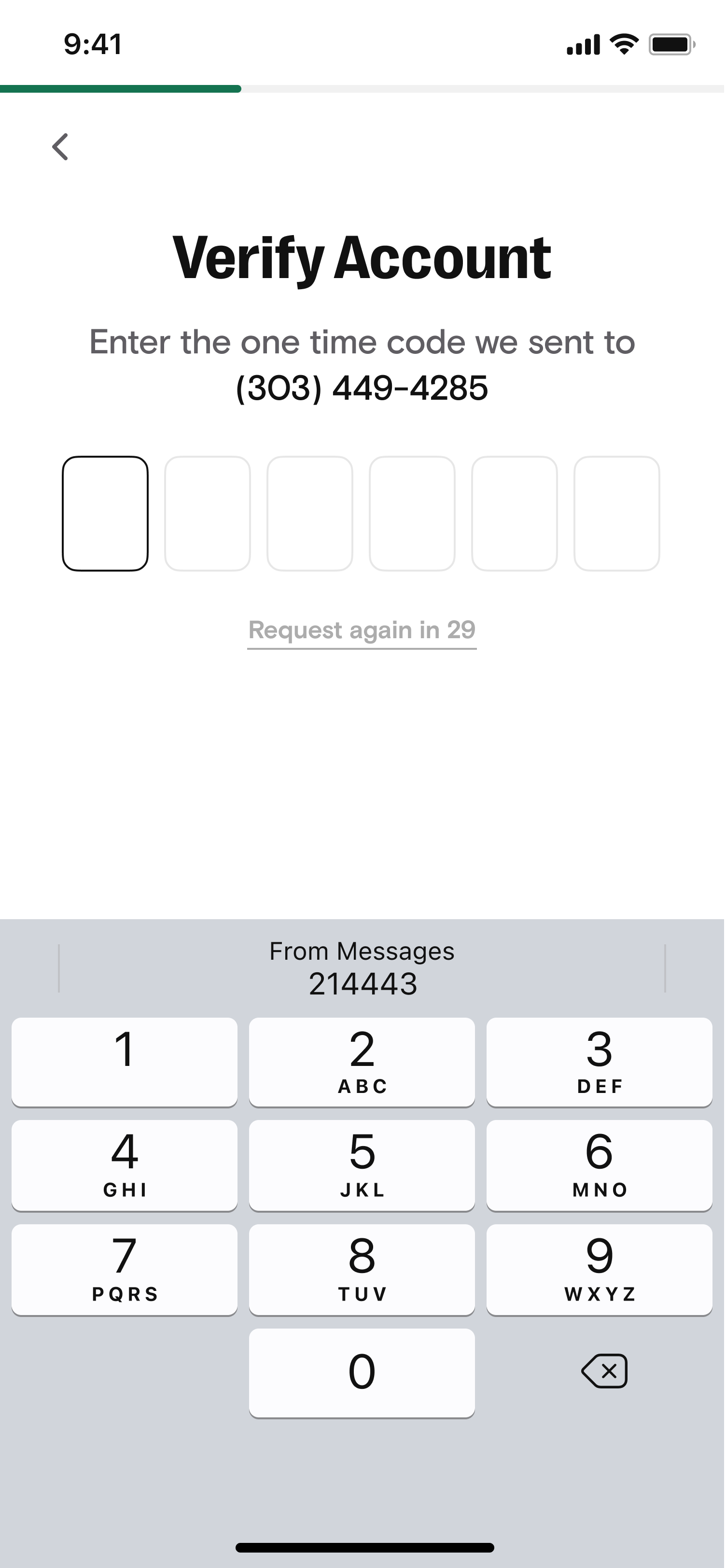
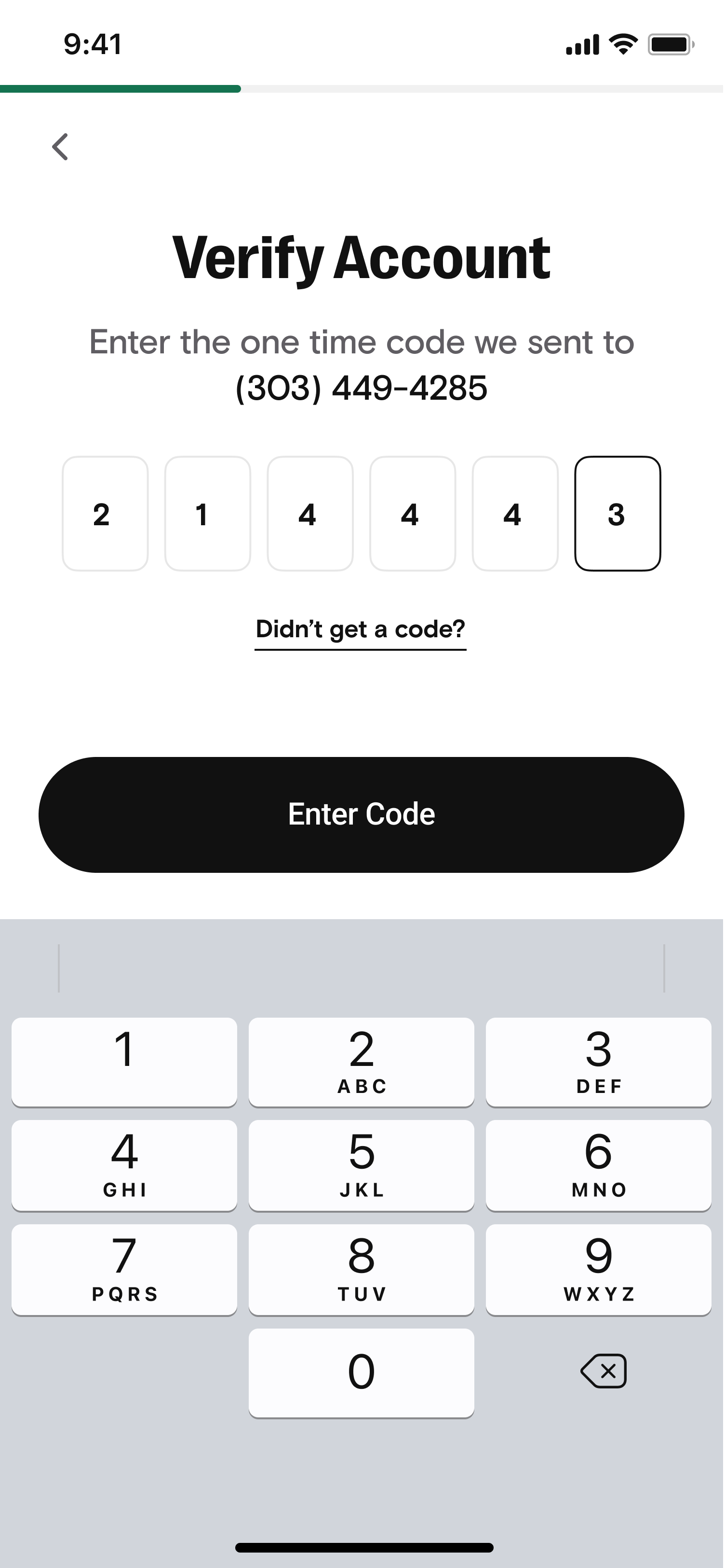
“Taye is one of the best UX writers I’ve worked with. When he first joined our team, I immediately noticed a keen eye for user experience. He always has clear reason for his writings/text within the specific design flows.
He has a positive attitude, and always tries to understand what others are saying. And, he is good at understanding the issues, situations, and complexities of the challenges that designers are facing. “— Yukiko Jones
Senior User Experience Designer
7-Eleven UX Consumer Team