Vehicle displays

As Toyota expanded its connected‑vehicle ecosystem, we introduced a unified Driver Profile experience, an onboarding flow that lets drivers personalize their vehicle, sync preferences across devices, and access safety and convenience features with less friction. My role was to lead content design across UX, product, and engineering to ensure the flow felt intuitive, human, and unmistakably Toyota.
The Challenge
Drivers were encountering fragmented setup moments across the vehicle and mobile app. Creating a profile required multiple steps; verifying identity, setting preferences, enabling services. Each surfaced inconsistent terminology and unclear guidance. This caused:
Drop‑off during setup
Confusion around what a “profile” actually enabled
Repeated steps across vehicle and app
Accessibility gaps in visual guidance
We needed a single, guided flow that felt effortless whether a driver started in‑vehicle or in the Toyota app.
Outcome and Impact
Higher completion rates
Clearer guidance and simplified steps increased profile creation completion by reducing confusion and unnecessary friction.
Stronger cross‑surface consistency
Drivers experienced a unified Toyota voice whether interacting with the vehicle or the app.
Improved accessibility
WCAG‑aligned language, predictable patterns, and clearer voice‑assistant prompts made the flow more inclusive.
Scalable foundations
The content patterns created for this project now support additional onboarding experiences across Toyota’s connected ecosystem.
My Role
As Lead Content Designer, I owned the content strategy, microcopy, and interaction language across the entire profile creation journey. I partnered with product owners, UX designers, engineering, and legal to define a unified narrative that supported clarity, trust, and ease-of-use.
Approach
As Lead Content Designer, I owned the content strategy, microcopy, and interaction language across the entire profile creation journey. I partnered with product owners, UX designers, engineering, brand, and legal to define a unified narrative that supported clarity, trust, and ease-of-use.
Map the end‑to‑end journey
I created a cross‑surface flow map covering:
Vehicle touchscreen
Mobile app
Account services
Connected features (navigation, safety alerts, media, driver settings)
This ensured terminology, steps, and expectations matched regardless of entry point.
Simplify decision points
I rewrote complex or technical steps into single‑action moments:
Identity verification → “Confirm it’s you.”
Service activation → “Turn on connected features.”
Preference setup → “Choose what feels right for your drive.”
Each screen focused on one decision, reducing cognitive load.
Build reusable content patterns
To scale consistency across future flows, I created patterns for:
Permission requests
Multi‑step onboarding
Error and recovery states
Cross‑device continuity (“Continue in your Toyota app”)
These patterns became part of the design system and were adopted across other vehicle setup experiences.
What This Demonstrates
Systems‑level content strategy
Multi‑surface UX writing (vehicle + mobile)
Clear, human onboarding flows
Collaboration across product, engineering, brand, and legal
Ability to turn complex or ambiguous requirements into simple, confident user guidance
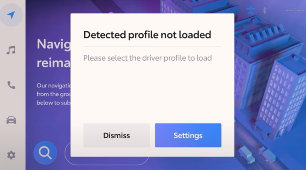
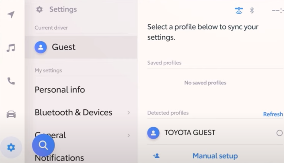
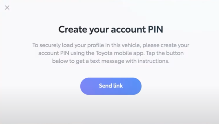
In this flow, the driver has discovered their profile is not loaded and therefore their phone is not synched to the system.
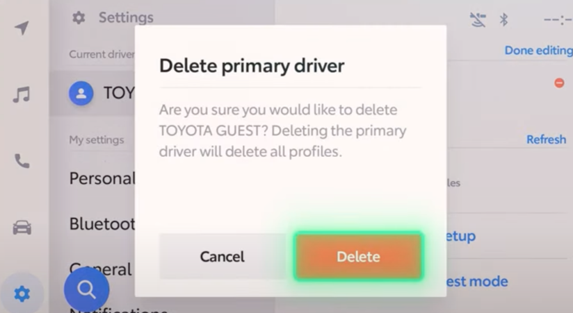
Though they are not technically driving the vehicle, they have entered what I call “operator mode”. Therefore, I designed the onscreen communication to be short, simple and directive.
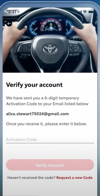
When, directing the user to continue an operation on another device, the instructions should be very clear.
Examples
The driver is directed to select a profile to synch the settings from their phone.
The tone in the messaging remains simple and directive.
Content for Toyota apps is handled by the brand team. I collaborated closely with brand to maintain the simple and directive tone.
Notifications are a critical part of the onboard communication experience, as they are competing with external factors for the driver’s attention. Here, I focused on delivering just the information that was needed for the driver to complete the action, or not.